
Data Analytics and Software: It still isn't easy
This post examines the work of producing analytics/visualizations and the role
software plays. Business Intelligence (BI) software, such as
Power BI,
Tableau, and
SAP Dashboards
are a few examples of software with a lot of buzz.
The marketing folks in that industry would have us believe their software enables analysts
to point and click at data and enable magic. This magic feature provides instant access
to interactive dashboards, drill-down functionality, and more.
Don't forget, the data will be reliable, accurate, easy to share, easy to secure,
and cross-platform (mobile-friendly) too!
Reality check
Data visualization software in 2018 doesn't have the magic feature working yet.
I believe it takes at least as much human effort today to produce a great visualization as it
did a decade ago. The improvements in the software are not making the process quicker or
easier. The reality is that working with data isn't for everyone, and
#DataIsHard.
I recently attended a PASS webinar by Scot Reagin who stated:
"90% of users are not self-service capable."
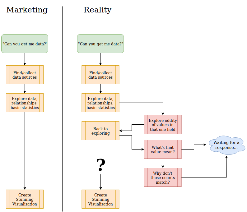
Typical data project workflow
It starts with an innocent request for a new report or visualization. The magic BI feature
should work like shown on the left side of the following diagram.
A more realistic path to the end product is shown on the right.
Tools
Regardless of industry or task, the quality of your tools has a direct relationship with your ability to complete work on time with high quality. BI software and data analytics work is no different.
"The best software for data analysis is the software you forget you're using. It's such a natural extension of your thinking process that you can use it without thinking about the mechanics." - Stephen Few
Lots of choices
The sheer volume of choices for BI software, along with database platforms, programming languages, and ETL tools presents a large part of the problem. There are tons of options for each of these, each with its own complexity, it's own micro-language of vendor-specific jargon, and it's own quirks, oddities, and outright frustrations. It's tricky, if not downright impossible, to determine the product's quality without many person-hours of effort.
A search for "data scientist tools" returns results with titles like 19 Data Science and Machine Learning Tools for people who Don’t Know Programming; search for data visualization tool and you'll see pages like Review of 20 best big data visualization tools. Now, try to weed out the least likely candidates and hope you don't throw out that gem in the rough on accident. Then, demo a couple of the best-looking options and kick the tires a bit...
Visualization quality
The quality of a data visualization is determined if the end user gets any value (understanding) from it. Nearly five years ago I wrote about the characteristics of a good visualization (and why infographics still don't provide this)
"....if done right, the end user will actually look at the data, think about the data, and use the data."
I don't see the overall understanding of visualizations improving. Instead, the amount of unproductive "noise" has increased. Stephen Few seems to agree.
"Most vendors, rather than focusing their efforts on the functionality that data analysts actually need, are looking for new and sexy features that make the people with purchasing authority—not the actual users—flush with excitement."
Data quality
As I wrote in the intro, it is never as simple as point-and-click to a few data sources, drag/drop a couple widgets, and poof you have a finished product. Getting the data in the appropriate format, quality, and model is a challenge. This part is as much an art as science. During Denise McInerney's PASS session Data Catalogs: Trendy & Necessary, she said:
"The ability to understand data is key to its value. Understanding is hard to achieve."
Documentation is a great way to improve data quality. I'm going to repeat that in case you missed it the first time.
Documentation is a great way to improve data quality.
Documentation for a database should be built into the database itself in its meta-data. Every proper database system has built-in methods to document the internal structure. Add in the use of comments on tables and columns it is possible and realistic to build a data dictionary. It isn't quick to properly document a database, but the core functionality and ability is there.
- Where does the data come from?
- What calculations are done on this data?
- Anything weird to know???
Make it easy to answer those questions!
Good software takes 10 years
Software maturity is also important to consider, and the market is relatively new. For example, Power BI was released to the public roughly 3 years ago, and we know good software takes ten (10) years to develop. More recently, Robert Moss wrote that timeline is still valid (emphasis mine).
"It’s a warning against the terribly unrealistic expectations on the part of software developers, end users, and—most importantly—the business and technology leaders who make decisions about ambitious new development projects. The crucial business mistakes Spolsky warned against in 2001—Get Big Fast syndrome, overhyping early releases, belief in “Internet time”—are still valid today. Most dangerous, in my view, is the misguided notion that if we just organize projects correctly, staff them with good people, and motivate them correctly we can somehow suspend the fact that making great software simply takes a lot of time and effort. It’s hard work."
Documentation and Education
Documentation covering your data is useful because humans have bad memories, and all data is nuanced. Documenting your data helps human analysts understand the data. It also helps humans detect and confirm when software tries to pull a fast one. Unfortunately, we often foolishly trust software even when we know better. I heard that loud and clear during Understanding Relationships in Power BI by Alberto Ferrari:
"If you don't master them [relationships], DAX will surprise you (and your users as well)" -
Alberto's session helped explain a few of my headaches in Power BI, now the real challenge begins post-conference trying to apply new knowledge. This also illustrates how important professional development, and conferences like PASS's Summit are. You can learn a massive amount in a short time. No matter how long someone works with data and technology, there is always more to learn.
Security
If you are working with data, you must keep security in mind. Security isn't easy in most scenarios. Many tools today make it extremely easy to share data, and that should scare you. Go back to the human element, and realize mistakes happen. You must properly plan, review, and audit your security controls, especially in software intended to share data.
Having a mix of public, restricted and private data sources creates a complex maze, and you do not want to get this step wrong. Security is a feature; you have to take time to review, test, and audit this feature. Further, evaluating security is a continuous activity, not a one-time thing. I recommend making this a regularly scheduled monthly task as a general starting point.
Making complex problems appear simple
Software is often intended to make lives easier. This attempt to be helpful isn't magic,
it's humans writing code trying to make software appear helpful.
Sometimes it works. Sometimes, that helpful nature turns into features
like Clippy. Shudder

It seems the approach of modeling data in Power BI (or other) is for the software to try to be as helpful as possible. It makes every attempt to make intelligent assumptions about your data model, and sometimes it even does OK. When the software can't automatically derive relationships or calculations, there's a GUI to change everything else. These BI software solutions try to hide the complexity of ETL (Extract, Transform, Load), data modeling, and analysis all in one nifty package. The goal of all of this is to make BI analysis more self-service accessible. What could go wrong?
Stephen Few again on the topic:
"Their attempts to assist data analysts are actually getting in the way and slowing them down. In both cases the vendors don’t understand where to draw the line between the work that a computer can do and the work that requires the human brain."
Software isn't good at everything
It might be hard to believe, but computers aren't well suited to all tasks. Data modeling (including ETL, validation, relationships) within a BI software tool is one of those tasks.
"Computers today are brilliant idiots. ... when it comes to another class of skills, the capacities for understanding, learning, adapting, and interacting, computers are woefully inferior to humans." - IBM Director of Research, John E. Kelly III, 2013
The problem is, data is not easy. Data is always dirty, after all, and cleaning and verifying dirty data in GUI-land by "helpful" software is mostly miserable.
It's still about the data
The real heavy lifting has always been, and continues to be, getting (and keeping) your data in a usable and reliable format. This typically should happen in a relational database such as PostgreSQL. Every set of data is different, with its unique challenges and nuance to the business. To be able to deliver succinct, accurate, useful information requires a solid understanding of the data model.
In 2015, I wrote about why it's important to let a proper database manage data, not some GUI tool that has a specialized purpose, other than data management.
New to PostgreSQL or relational database design? Check out my database design series!
The human component
I think this is the truly difficult part: Determining what you can show to your end users. You can ask them what they want to see, but what you'll probably get is a long list of interesting concepts; this is the kitchen sink wish-list. In reality, this is very different from what the user actually wants to see. Software can't help you decide what to data to look at and how to properly aggregate it.
Steve Jones recently talked about the idea of a data scribe:
"... a specialist in the gathering and cleaning of data, preparing it in tools that business people then use to perform their analysis, working for multiple people. Need more data? Ping your data scribe, someone that knows the structure, meaning, and location of data."
Sounds like a good data scribe is what's needed to help the "90% of users [who] are not self-service capable."
Onward we go
As time goes on, our existing tools will improve, new tools will arrive, and some old tools will live on. Data will continue to be hard, but as our tools and our understanding improves we can change the balance.
Professional development and documentation are some of the best tools for staying on top of our quickly changing environment. Machine learning, AI, and many other really cool technologies are becoming more prominent and mature. The software isn't there yet, but the industry is moving in that direction.
 Mastodon