
Visualizing Colorado's Growing Population: 2010 to 2016
If you live in Colorado, you probably are familiar with a trend of quickly growing populations, more crowded traffic and hard-to-find homes. This post examines the change in population from 2010 to 2016 in Colorado using data from the American Community Survey. This analysis timeframe starts before the major boom really began and looks through the peak of growth in 2015.
... in 2015, when Colorado saw more than 100,000 new residents.
Media in this Post
The medaia content in this post (maps and charts) are intended to be visual by nature. The bar charts included provide tooltips on hover (or a tap on mobile) and look great on devices of all makes and sizes. Included above each chart is a link to open that chart in a new browser tab. This provides a better on-screen experience with data-heavy charts.
The maps included in this post were saved as high resolution (600 dpi) PNG images. To see the full details on each map, right-click the image in your browser and open the image in a new tab. This allows you to zoom and pan around the displayed area.
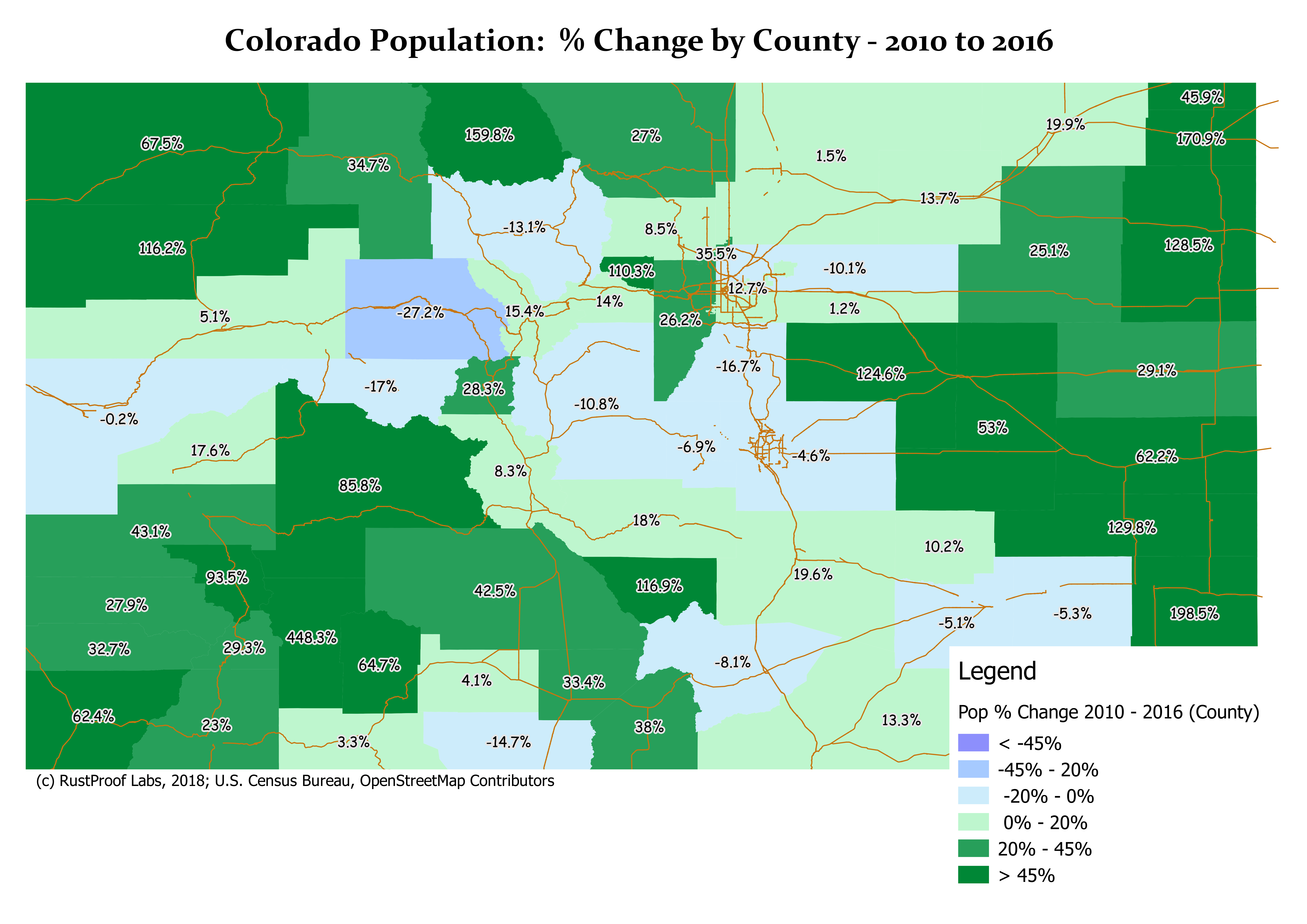
County Data
The following bar chart provides a different way to look at the population growth by county. This provides the percent change in population by each county in Colorado.
Click here to open the chart in a new tab for a better experience.
The next chart shows the actual number of change in population by county. While the chart looks very similar to the previous chart, the data represented is quite different.
Click here to open the chart in a new tab for a better experience.
Top 5 Counties, by % Growth and # of Growth
The following two charts chart shows the top five (5) counties in Colorado by two different metrics:
- Percentage (%) increase
- Population (#) increase
Areas that experienced the highest growth rates were mostly rural with low populations while the majority of the state's overall growth came in five (5) different counties. The two set of five counties are mutually exclusive.
Click here to open the following chart in a new tab.
Click here to open the following chart in a new tab.
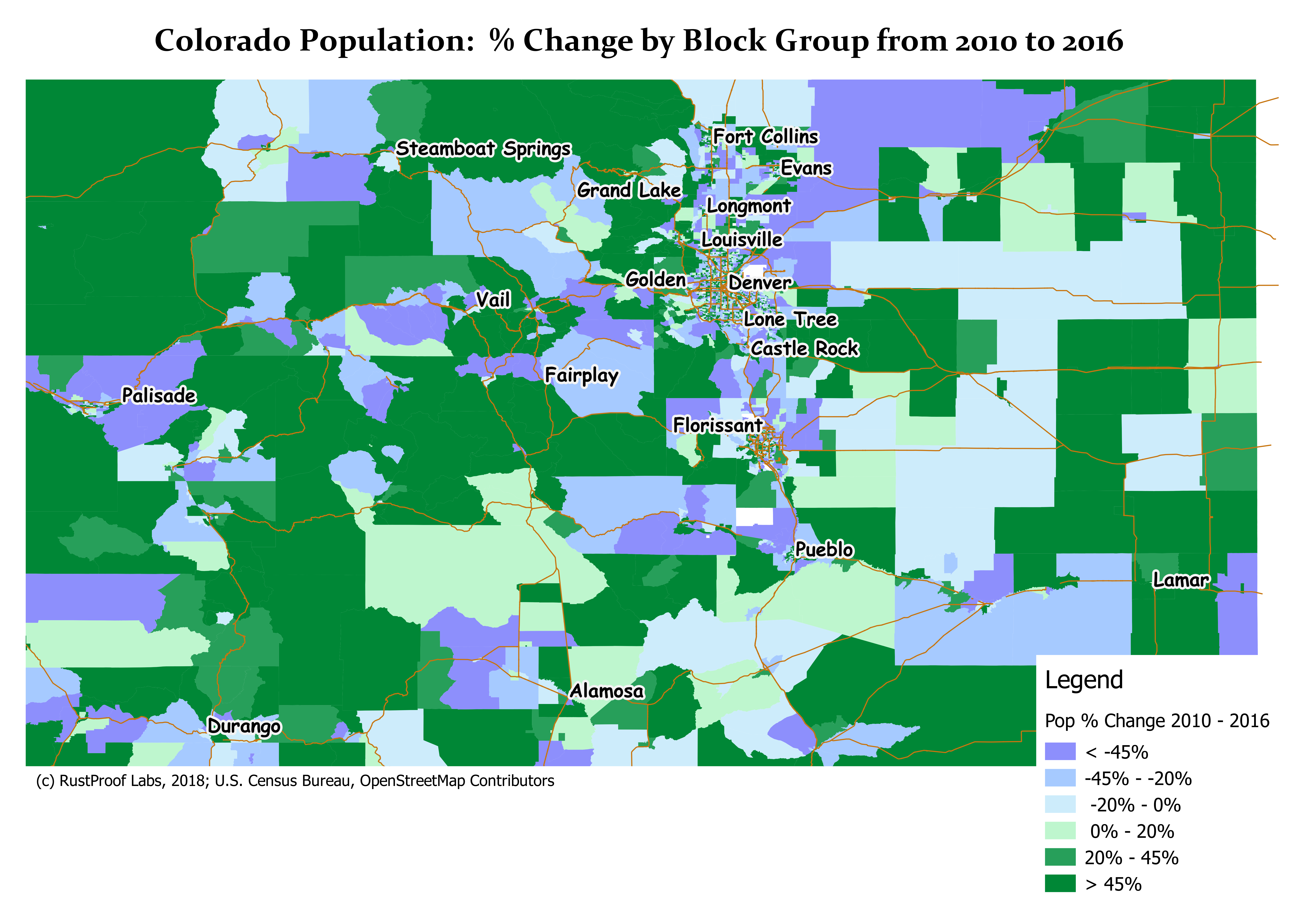
Smaller Areas of Analysis
The county level chart show above is interesting, though often it's desireable to break down the data by smaller regions. Luckily, the U.S. Census Bureau provides this information at the block group level. This provides a much a higher resolution picture in urbanized areas and see more nuanced details.
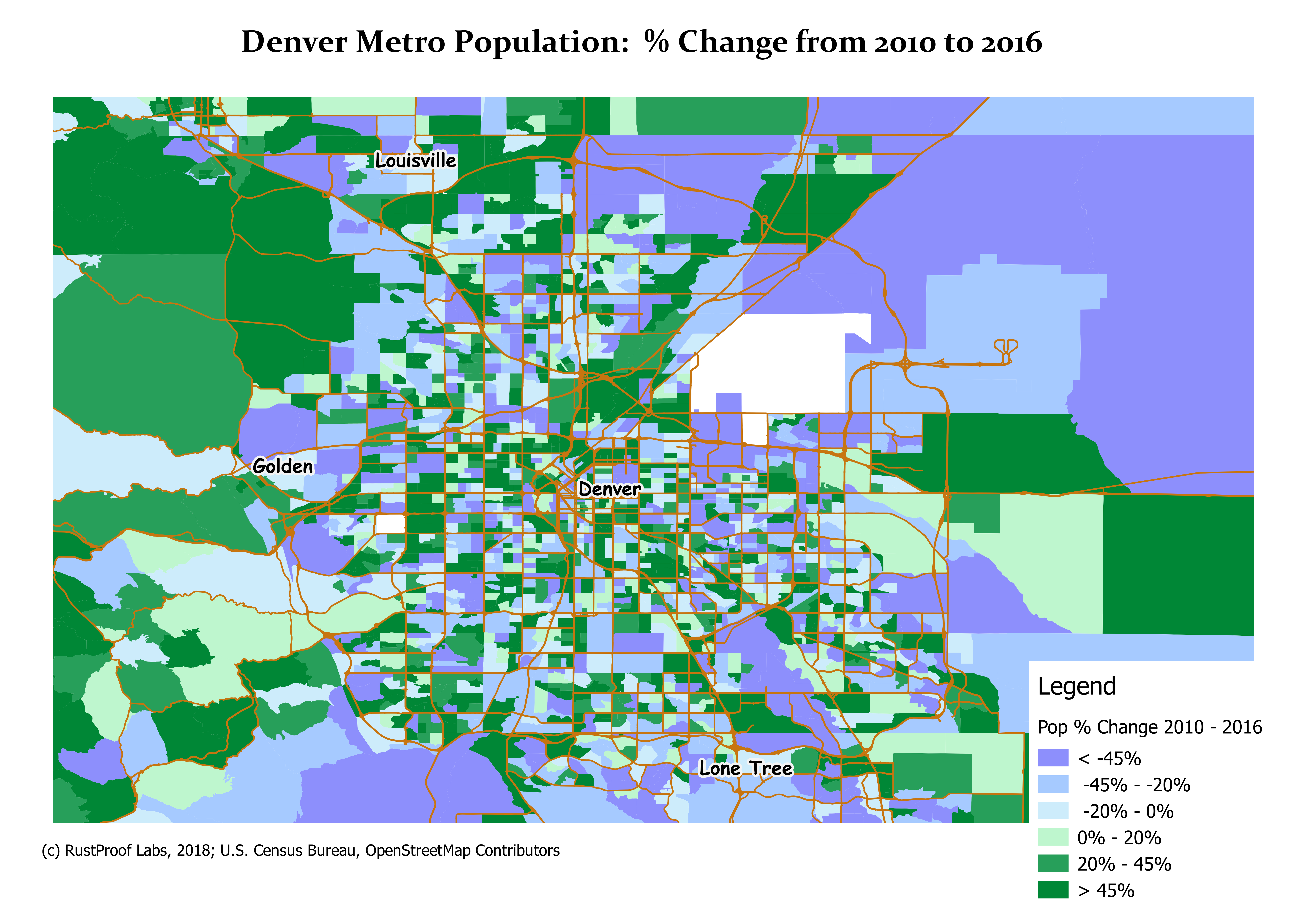
Denver Metro Area
After examining the broader state-level detail, I was curious about more specific areas.
The following chart provides a view of the change in population centered around Denver, CO.
This region includes Golden, Louisville, Arvada, Aurora, and Lakewood.
While the area saw increasing populations in general, there are plenty of specific areas
that saw declining populations in this time frame.
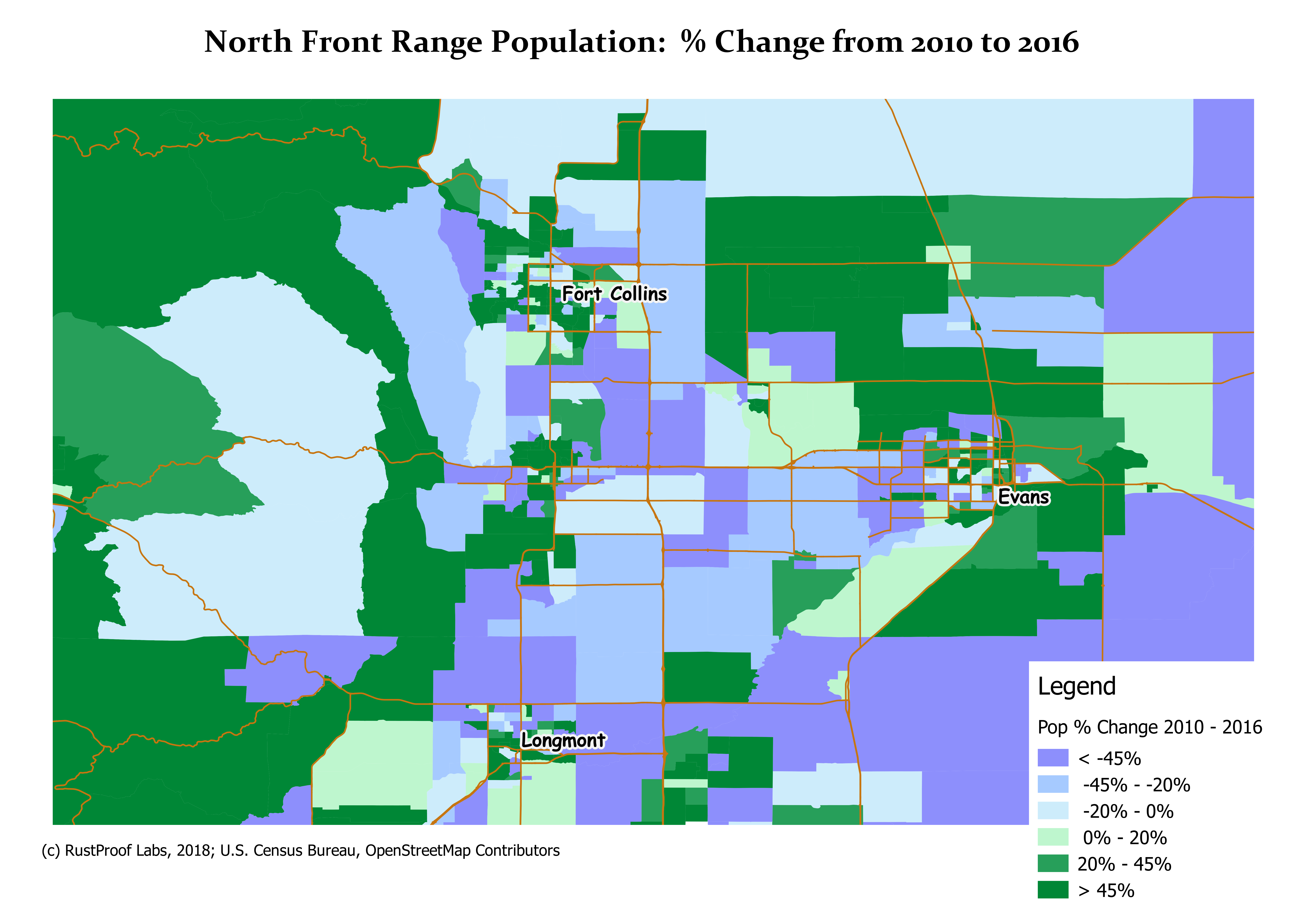
Northern Front Range
The northern areas of the Colorado Front Range include Fort Collins, Longmont, Loveland and Greeley. These census blocks span larger areas than the Denver metro area
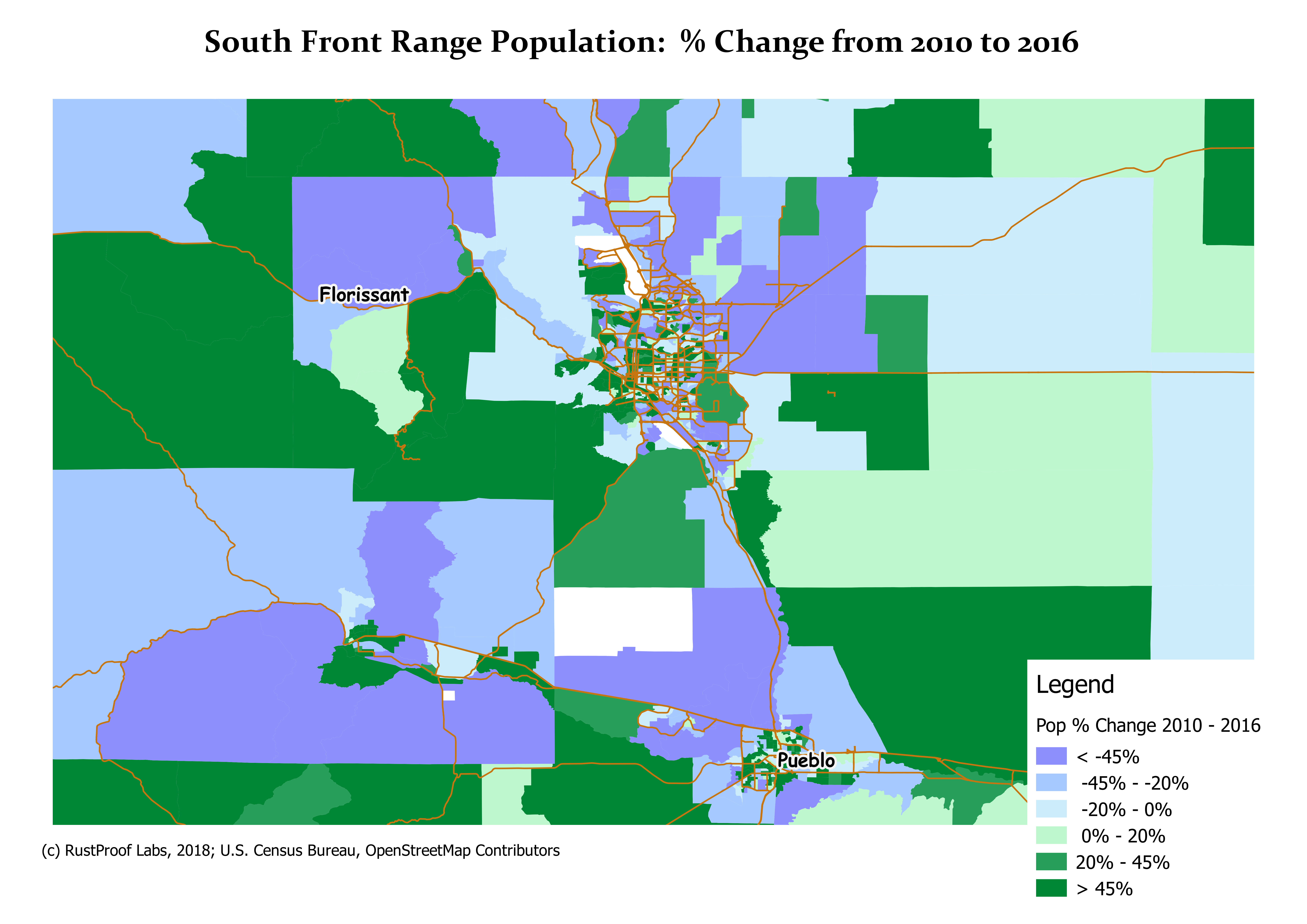
Southern Front Range
The following map shows the souther front range of Colorado including Colorado Springs and Pueblo.
About this Analysis
The analysis and visualizations in this post used data from Tiger/LINE (U.S. Census Bureau), the American Community Survey (ACS), and OpenStreetMap.org. The data was loaded using the ogr2ogr tool to a PostgreSQL database having the PostGIS extension installed. PostGIS provides advanced spaitial data storage and analysis directly within a PostgreSQL database with handy SQL syntax.
Map visualizations were created using QGIS, while charts were created from Jupyter notebooks and the PyGal Python module. The county boundaries used were from the Tiger/LINE 2014 data set. Block group boundaries were from the Tiger/LINE 2016 data set.
Population data by county was loaded by block group and aggregated to the county level.
Percent change is calculated as:
% Change = (# Current - # Previous) / # Previous * 100
Summary
This post has provided a visual tour of the population growth across Colorado from 2010 to 2016. Looking at raw numbers is only one part of the full story, there are a plethora of demographic, economic and other data available for industry-specific analysis. While the largest rate of growth is probably behind us, Colorado is still growing. Colorado was ranked eigth in the U.S. for total number of new residents (77,049) between July 1, 2016 and July 1, 2017.
If you need an analysis conducted, please contact our support line.
 Mastodon