
Maps! ArcGIS, QGIS, and TileMill
In this post I will discuss some of the various options for working with spatial data. I have been using ESRI's ArcGIS suite for roughly four years now but have also recently started working with some more freely available tools, QGIS and TileMill, and thought this would be a good time to write about some of my experiences. You can see an example of what I've done with TileMill at my post here.
Before I get into the various pieces, I want to explain the main ways I use mapping software. This is important because there are many reasons to use mapping software so if you have different experiences feel free to share in the comments. My uses are:
- Data exploration / analysis
- Generating static maps for consumption
- Generating dynamic maps for consumption
Data exploration and analysis is always key because for every different type of data I work with, there's a learning curve on formatting. Even when the end goal is to generate an high quality end result for someone other than myself, I always have to work with a number of layers and data sources and that can get time consuming. Key points I'm looking for are how quickly I can navigate around the map, and how quickly/easily I can do some rough styling to see trends emerge.
The final, polished maps for consumption are typically static in either PDF or PNG format to supplement a bigger report of some sort. All of the options I'm covering here can handle that with no problem. There are times when a slippy map would be more suitable to the data and encourage exploration of the data. I haven't gotten quite to that point yet but I'm working on a couple projects that I would like to implement more dynamic maps on. (Stay tuned for an update on that!)
ArcGIS
I'll start with ArcGIS since I have the most experience with it. This is pretty much the industry standard for mapping software and it is incredibly powerful. When I started working at Front Range Community College I inherited all things ArcGIS related and I was happy to do so. We produce maps showing where our students live each term, do some spatial analysis for marketing purposes, and some other program related mapping needs. I even made disaster maps to help our staff assess how many of our faculty and students were affected by the 2013 floods in Colorado. (It's rare that I get to have an immediate impact like that!)
While I can accomplish pretty much anything I want in ArcGIS, it has always felt unintuitive and slow to me. It's one of the only things I can't use via remote desktop; the slight latency of using RDP mixed with the slow rendering of ArcGIS makes it incredibly irritating to use. For example, just trying to expand the Toolbox on the left side can take 5 or more seconds on my quad-core desktop w/ 8GB RAM.
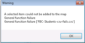
Amazingly, my biggest complaint with ArcGIS are the error messages. I have rarely seen error messages as unhelpful as those. Here's an example of what happens if you try to import a csv file. It took me hours to figure out that if I saved it as a tab delimited file it would work perfectly. But come on... General function failure? Yipe.
QGIS
Now, onto QGIS, an open source, cross-platform alternative to ArcGIS that I discovered a few weeks ago. After installing on my Mac (awesome) I booted it up and immediately felt comfortable. They obviously built the UI to look and function very much like ArcGIS... only more intuitive and better styled. That's a very good thing! The next thing I noticed is that QGIS renders maps blazingly fast in comparison and it seems to have much better data caching than ArcGIS. Once you've loaded a boundary, there really isn't much lag, even with my relatively puny 13" MacBook with a 5800 RPM drive. My ArcGIS data comes over our private LAN from our SAN, so that surprised me.
It seems to have fewer built-in processing tools than ArcGIS which didn't surprise me, nor does it concern me since I've never used most of what's there. I can't vouch for the quality of error messages, as I haven't really encountered any yet in QGIS.
Formatting isn't my favorite thing in QGIS. I can get the job done but it just seems tedious, and not always possible to do the advanced formatting that I want it to. Finally, it doesn't handle multiple monitors very well for me. It likes to put pop-up dialogs on the 13" screen on my laptop instead of the 23" LED widescreen I am currently working in. Pandora is on that screen, so I'm used to ignoring small movements on that screen... sigh I keep clicking...
TileMill
TileMill is the other program I've been experimenting with, but have worked with it a bit more than QGIS at this time. It's made by the folks at MapBox and in a sense it's a reinvention of mapping software, and is by far my current favorite in all but a few cases. Like QGIS it is both open source and cross-platform running on pretty much any modern computer. While there is a Mac version, the bundled installer (.dmg format) wasn't yet updated for OS 10.10 Yosemite. Instead, I installed TileMill on one of my Debian VMs, and access it through my browser on my local machine, which is preferable to me anyway.
The biggest downfall with TileMill right now is there's no way to save a "base map" that contains my typical layers and styling and then clone it for new projects as needed. I think I might be able to write a script that does just that by copying the files manually, but I haven't gotten around to trying that out yet. If that feature were added, I wouldn't have any reason to use QGIS at all.
The biggest strength in TileMill is the way formatting the layers is handled. Instead of having a GUI to define all the styling, TileMill uses CartoCSS, a derivative of the CSS language used by HTML. That's cool to me for a three reasons:
- Allows storing styles easily in Git
- I already know CSS
- Attribute based styling is powerful I won't discuss the first two items further, but the third merits explanation.
CartoCSS vs GUI Styling
Say you have a shapefile containing points for all the cities in a state. Naturally, you'll have some very large cities and some very small towns in the same file, and there isn't enough room to display all of those cities at every zoom level. You'll end up using attributes (columns) in the data (tables) to filter elements, such as population, to determine what to display and how to format those objects.
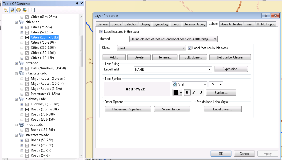
First, let's look at using a GUI to style this cities layer. The examples I give here will be from ArcGIS, but since QGIS is so similar I won't duplicate screenshots. In the screenshot below, each Cities item on the left represents the layer for a specific zoom range. Each layer has a "Layer Properties" dialog like what is shown on the right. By navigating through the 11 tabs (11?!) you can eventually style each layer as you choose. If you can find the options you need, that is because each tab is riddled with buttons and options and little labels here and there.
Pro: You can format everything exactly how you want.
Con: It will take forever. Every time you need to format a layer.
(click for full size)
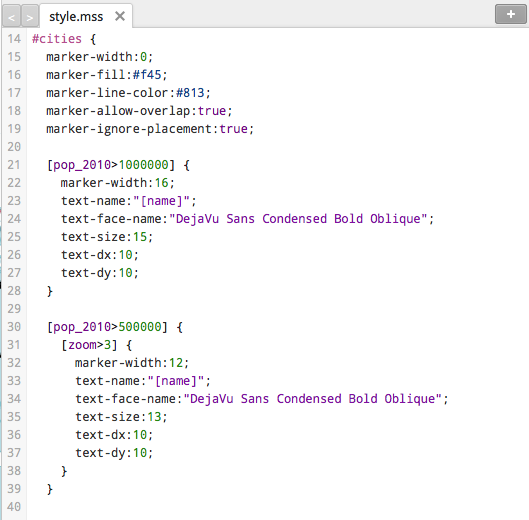
Now for a CartoCSS example, you can see it's just a bit of code. This is a very simple example, but it can be made as complex as you need. With some clever ordering (layers defined first are drawn first, and thus the first rendered layer) you can create some very clever effects. You can even just use OpenStreetMap's style!
TLDR; (aka Summary)
These are three examples of amazingly powerful software, and they're all great in their own aspects. If you need features that only exist in ArcGIS and aren't available in the other two I looked at, ArcGIS is your choice. I personally don't need the full power of ArcGIS and the bloat caused by all of its power dissuades me.
If I want to quickly navigate a lot of data, explore new data, or any other "quick & dirty" mapping I will turn to QGIS. From my experience it is light speeds faster than ArcGIS and seems to handle caching better than TileMill. It's also the easiest to add and remove small and even large layers, like the entire OSM file for the United States. Finally, for creating a polished look with the least amount of effort, TileMill wins on that one hands down. I've worked with CSS for a decade now, so CartoCSS came very naturally to me.
Have you had different experiences with mapping software? Let me know in the comments!
 Mastodon